What’s goes into a Logo?
What’s goes into a Logo?
Working with the title of my comic.

In today's world, it is possible to hire an AI designer online to create a logo. However, I prefer to design my logo myself or at least have some major input into the design process. Currently, I am focusing on the relaunch of the Margo Intergalactic Trash Collector series, with emphasis here on the logo. Over the years, I have designed and redesigned the logo multiple times. Additionally, I have hired other artists to create a logo based on my description and requirements.
Please find below the rewritten text with corrected spelling, grammar, and punctuation errors:
Each logo should serve one of the following purposes:
create a mood for the viewer or convey a message.
the logo must be readable, and this can be achieved by using colors that make it stand out.
There are two schools of thought on this matter. One group believes that the logo should be as easy to read as possible, mostly editors, while others think that the logo should be based on aesthetics. There is no right or wrong approach. I have seen logos that are not easy to read, but convey the mood of the project and are relatable to the viewer. I was trained to create logos for print, but this process has been evolving as we move to digital formats. If your logo can look great in both print and digital formats, it is a winner.
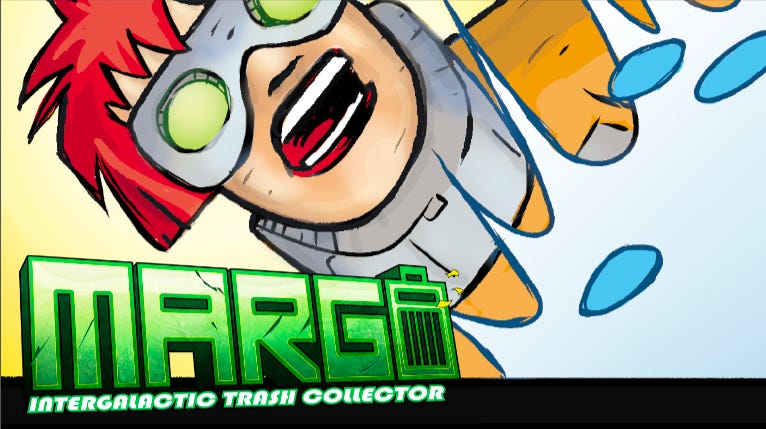
I have designed many logos over the years, magazine logos, book logos, and my favorite; comic-book logos. When I first launched Margo Intergalactic Trash Collector I created the original Margo Intergalactic Trash Collector logo pictured. I continued using this logo for several Kickstarter campaigns.
The evolution
The evolution of the Margo Intergalactic Trash Collector logo began when the series was relaunched into the direct market. To improve the series, starting with the logo, I decided to hire someone to create a new logo and bring a fresh perspective to the project. I believed that an outside perspective could bring something new and exciting to the series.
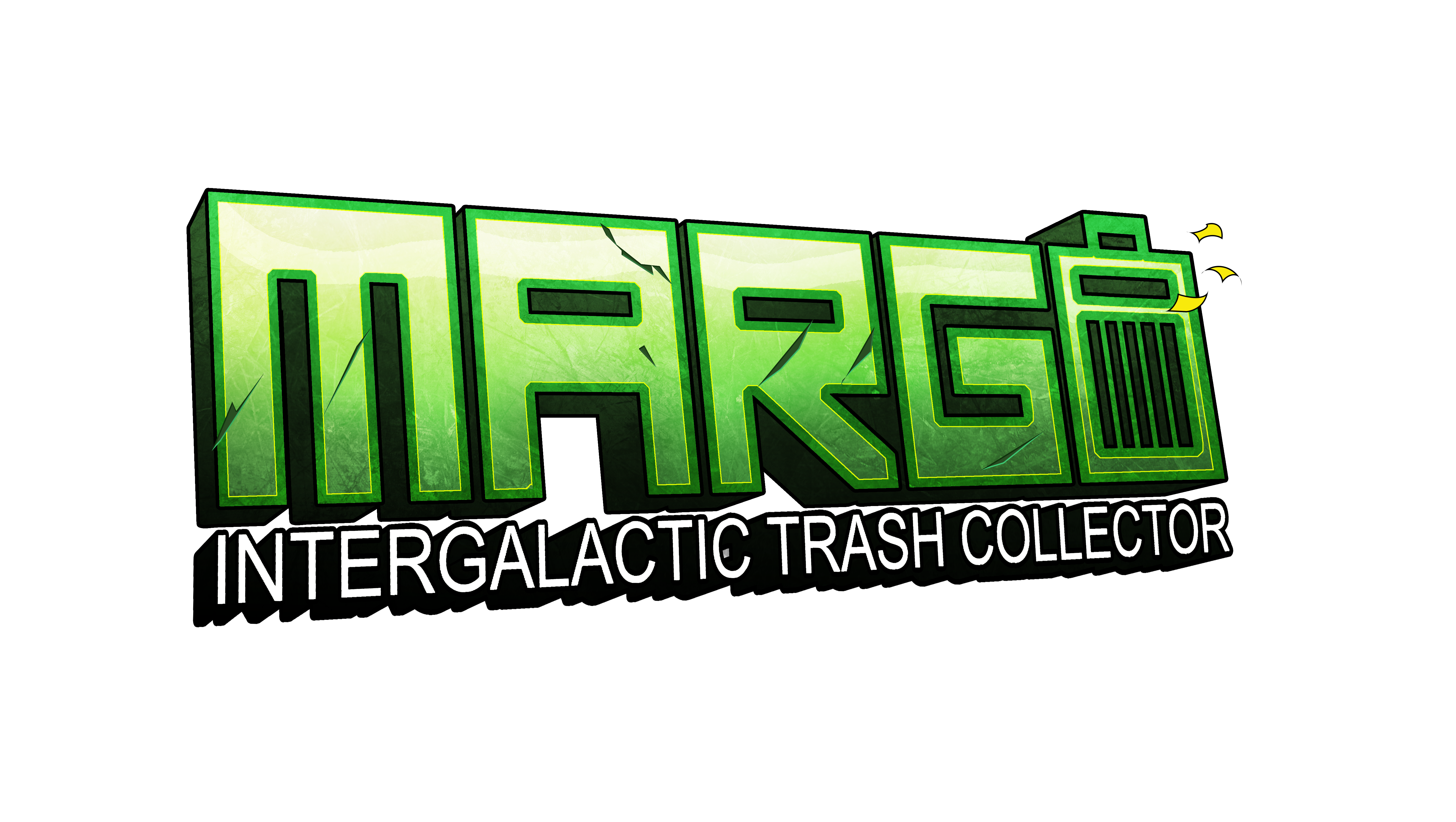
I like the design of the logo, especially the way the trash can is incorporated into the letter "O". However, I have some concerns about the "Intergalactic Trash Collector" typeface. It seems like it was added without much thought, unlike the "Margo" name which was well-designed.
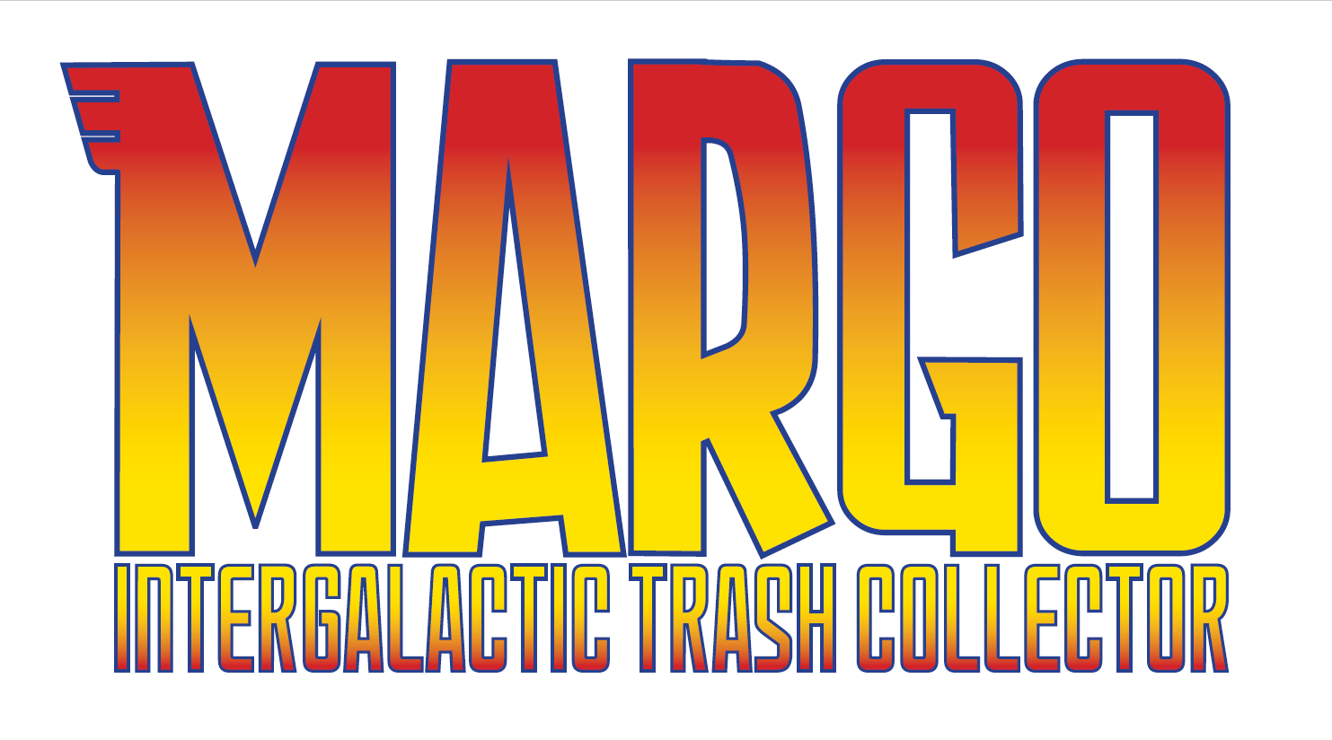
The Revision.
As I prepare to relaunch the series with new material, I have experimented with different typefaces. After much consideration and revision, I have decided on a typeface that conveys a fun, 70s-style vibe that fits the mood of the book. Since it's a space adventure, this typeface is a perfect for the feeling I want to create for this series.

Here is the elevator pitch, let’s see if it fits the property.
Are you a fan of the quirky and visually stunning world of "The Fifth Element," the cosmic creativity of Jack Kirby, the epic space adventures of "Star Wars," and the rebellious spirit of "Tank Girl"? If so, you're in for an intergalactic treat with "Margo: Intergalactic Trash Collector!
Please let me know your thoughts. Which version is your favorite?
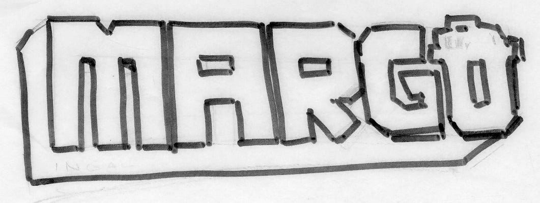
The Workflow
To create these logos I used these programs: