
Working in Color Modes
Choosing the Right Color

If you’re an artist working in illustration or comics, one technical aspect you’ll deal with often is color mode. There are many options available today, but unless you’re a photographer or producing high-end photo prints, these are the four you’ll use most of the time.
Let’s take a look at them.
Line Art
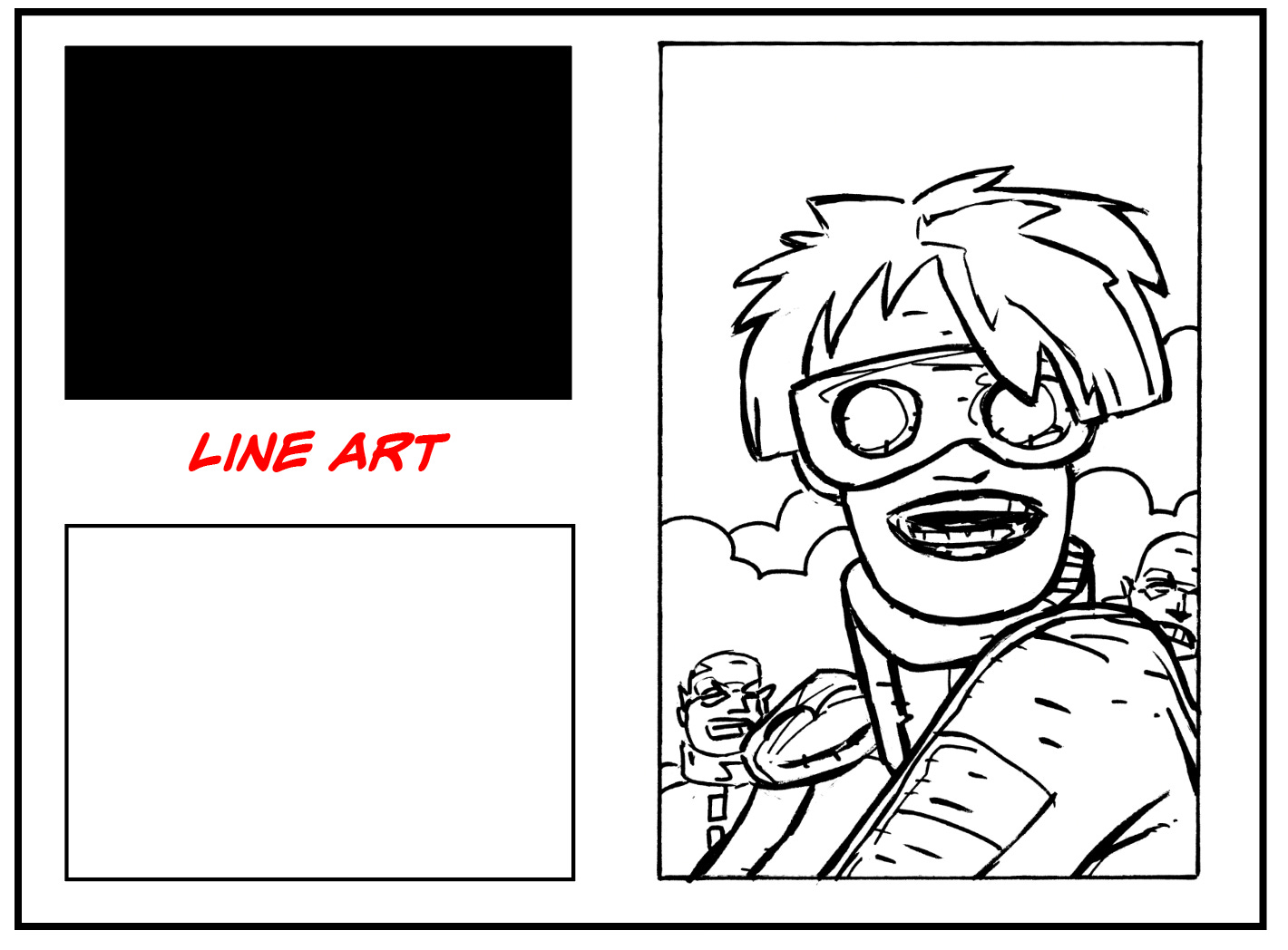
Best suited for exactly what the name implies: stark black-and-white artwork with no gray tones or color. Artists often scan inked pages in this mode to eliminate blue or red pencil marks used during the preliminary sketch phase.
Digital artists achieve the same result by placing rough sketches on a separate layer, which can be turned off once the final inks are complete. If you don’t color your own work—or primarily work as an inker—this is often the preferred mode.
Grayscale
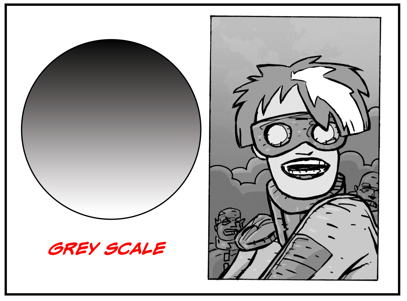
This mode includes black-and-white line art along with a full range of gray values. It’s useful when your work relies on shading rather than color. I often use grayscale when scanning previously printed black-and-white material.
RGB
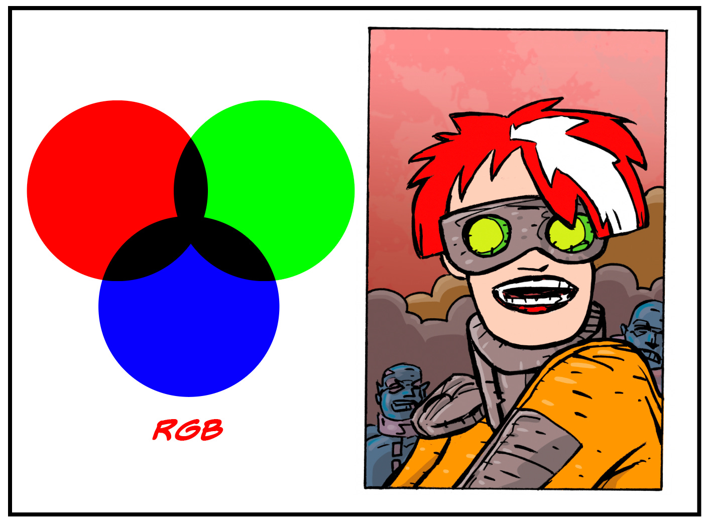
This is the color mode used by screens—computers, tablets, and phones. RGB stands for red, green, and blue, which combine using light to create a wide range of colors.
Because it’s light-based, RGB tends to appear brighter and more vibrant on screen. However, that vibrancy can shift when converting to print. Some colors may appear muted when translated into CMYK.
Programs like Clip Studio Paint work primarily in RGB and convert to CMYK for print. Because of this, I always double-check my files after conversion and, if needed, adjust saturation to bring the colors closer to what I originally saw on screen.
CMYK
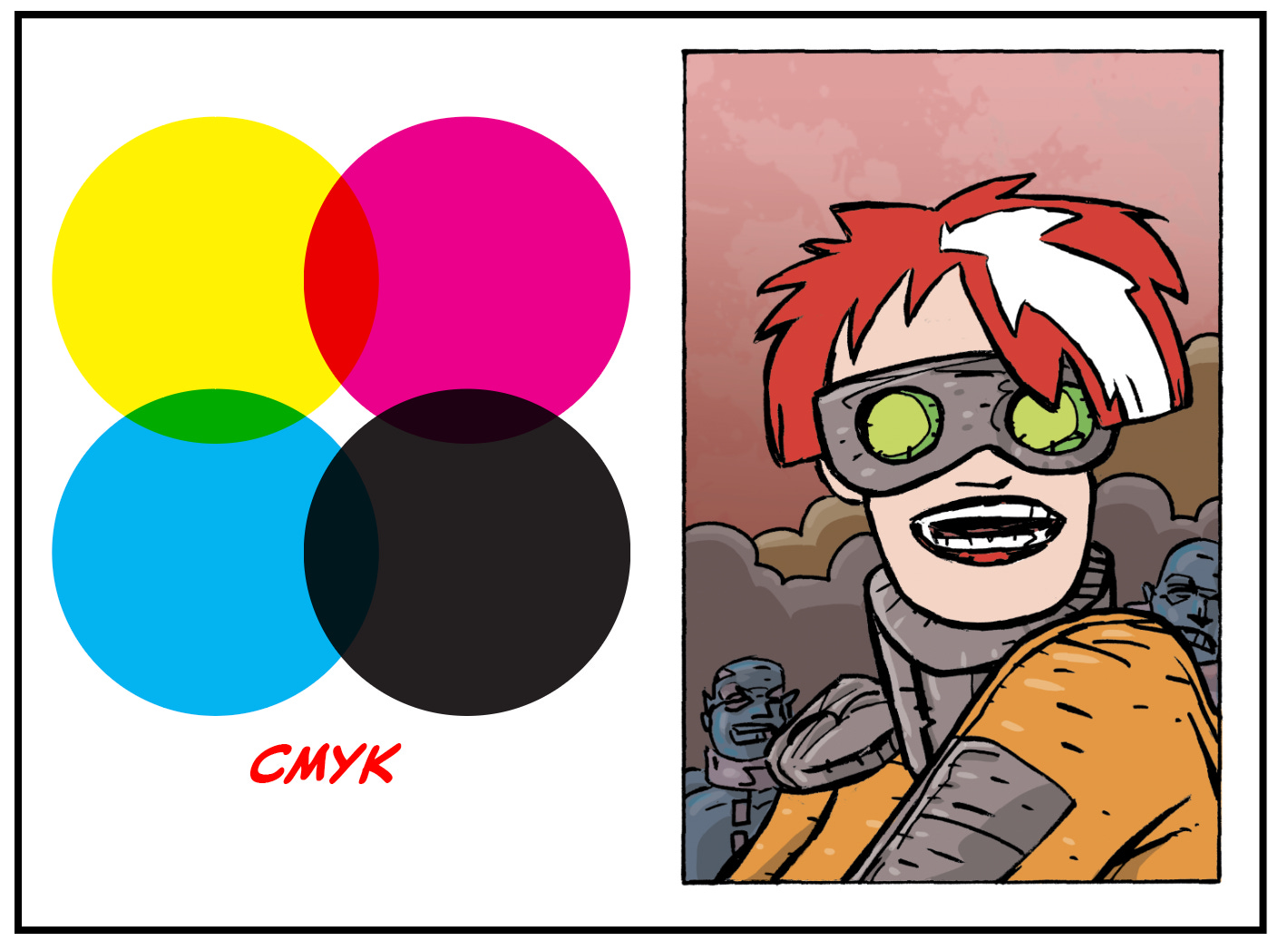
Most commercial printing is done using four colors: cyan, magenta, yellow, and black (K). Printers separate your artwork into these components to reproduce color on paper.
Unlike RGB, which uses light, CMYK relies on ink absorption. This difference can affect how colors appear—especially more vibrant hues like reds.
While modern digital presses are more accurate than ever, variations still occur. A good rule of thumb: no two printing presses are exactly alike. The same file printed on different machines—or even different paper stocks—can produce noticeably different results. Paper quality, ink absorption, and press calibration all play a role.
For this reason, it’s often a good idea to convert your files to CMYK before sending them to print, so you can preview and adjust any color shifts in advance.
Next: Resolution
Keep Creating,

How do you achieve the dot pattern look as seen in the thumbnail?