
The Weight of Lines
Creating the Illusion of Space

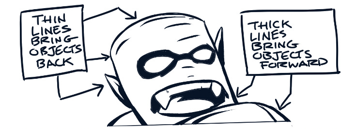
One thing I’ve noticed in a lot of newer comic art—especially with the rise of digital coloring—is a loss of line weight. Without variation in line thickness, the art can easily look flat, lacking a sense of space and physical weight. Traditional inkers relied heavily on line thickness to push and pull elements within a 2D composition, creating a convincing illusion of depth.

Digital color has expanded the comic artist’s toolbox in amazing ways, but it doesn’t replace one of the most fundamental tools for building space: the line itself. Working only in black, the thickness of a line determines where the viewer places an object within the scene.
Black ink traditionally served three main purposes:
To bring objects forward or push them back using line thickness.
To add shadow, reinforcing depth and creating mood.
To feather and shape forms, giving objects visual weight.
Each of these deserves its own discussion, so here I’ll focus on the first: using line thickness to create depth.
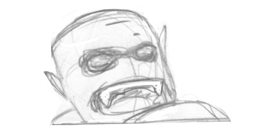
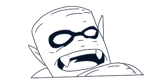
Below I have added lines, and turned off the layer containing my sketch.
Some artists intentionally use consistently thick or thin lines to achieve a specific aesthetic. Breaking traditional comic-making “rules” can lead to original, intentional results. But one of the best lessons I took from my days in art school was this:
If you’re going to break the rules, know the rules first.
Next time, I’ll dig into using blacks to create shadow and mood.
Keep creating,

The Universe’s Trashiest Comic — read it for FREE!

A new installment is up now…Stay tuned!
Nice take. re: line weight.
Agreed on all of this. I tend to believe that the rise of digital art has taken away some of the basic skills we all learned coming up through art school and the like.