
Danger Stranger!
Creating Cover Art for my Comic

After a few weeks of setbacks in the studio—personal stuff, software conflicts, and printer issues—I’m finally getting back to making art. It feels good to be back at the drawing board (or tablet).
If you’ve been following along, I’ve been working on a new Margo: Intergalactic Trash Collector series and sharing my process as I go.
One of the most rewarding—and challenging—parts of the project is creating the cover. The cover (or main image) has to set the tone for the reader and capture the essence of the story in a single, striking visual.
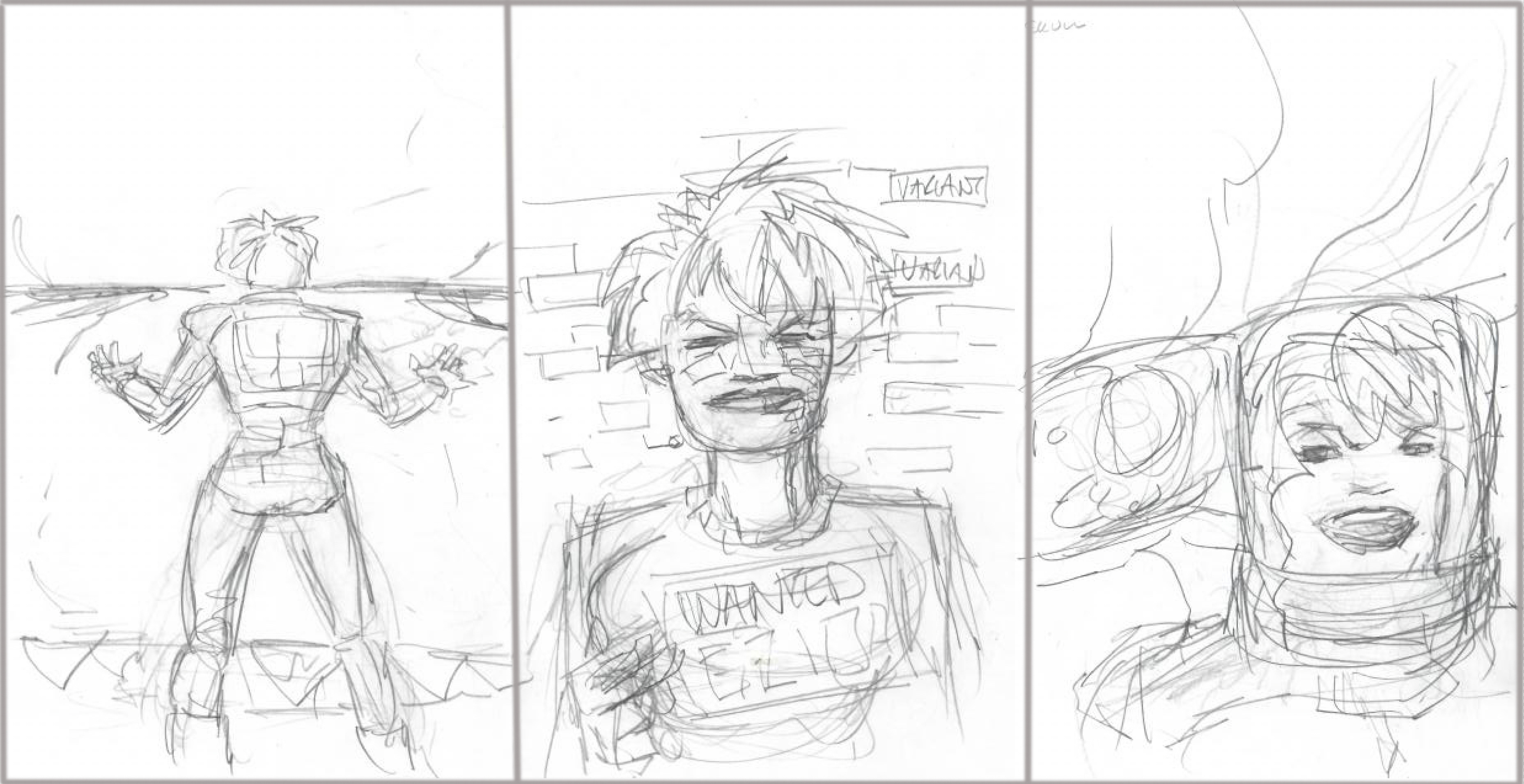
There are many ways to approach designing a cover for a series, but I knew I wanted to create a scene that showed Margo in danger. I sketched out several different scenarios (as shown above), but none of them really excited me or captured the tone of the series I’ve been developing.
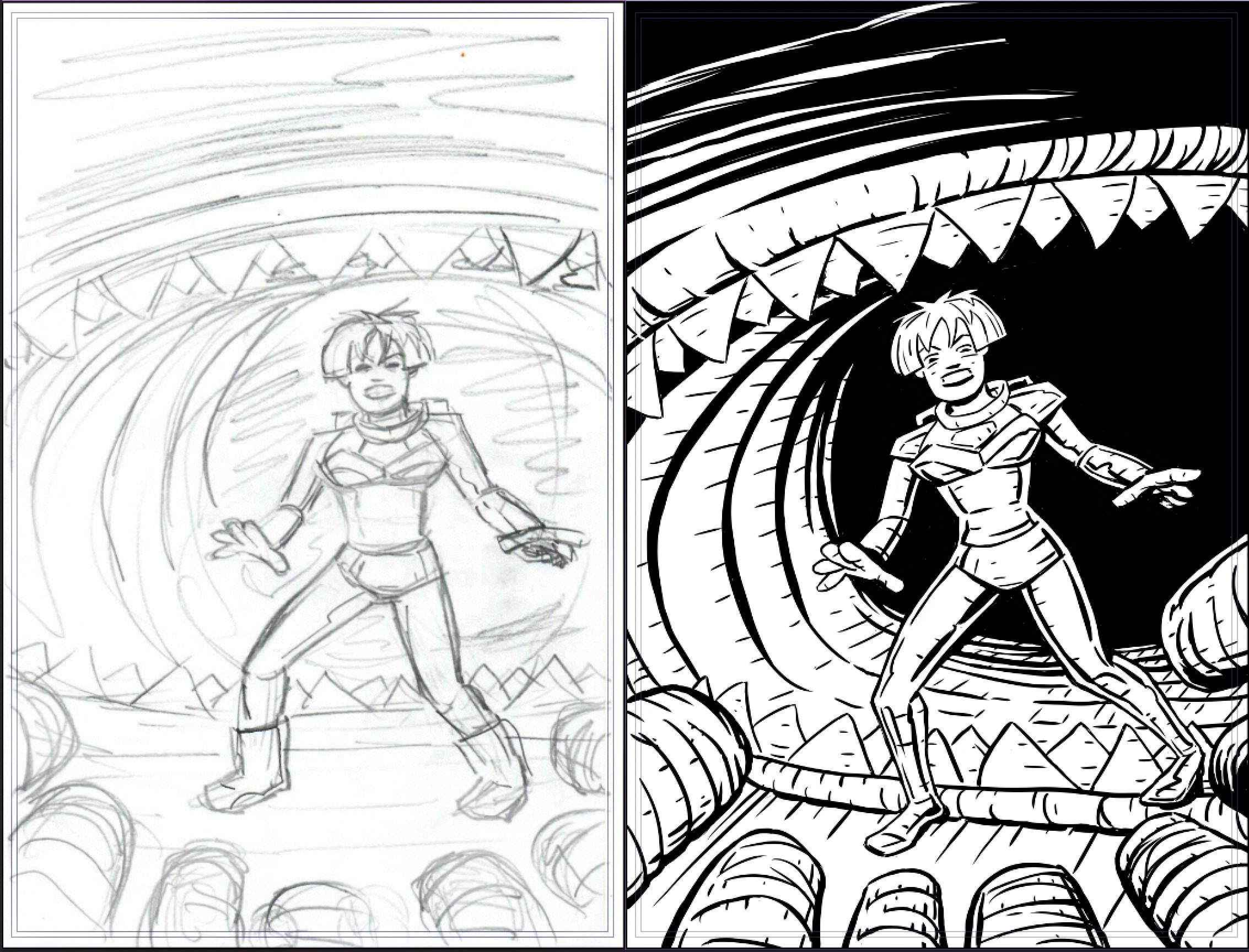
I ultimately chose the sketch on the left, incorporating key elements from the story and presenting them in a more dramatic way.
On the right is the finished line art—or, if you’re old school (and I am), the “inks”—done in Clip Studio Paint. As you can see when comparing the two, I adjusted some of the angles and scaled certain elements to heighten the sense of action and menace.
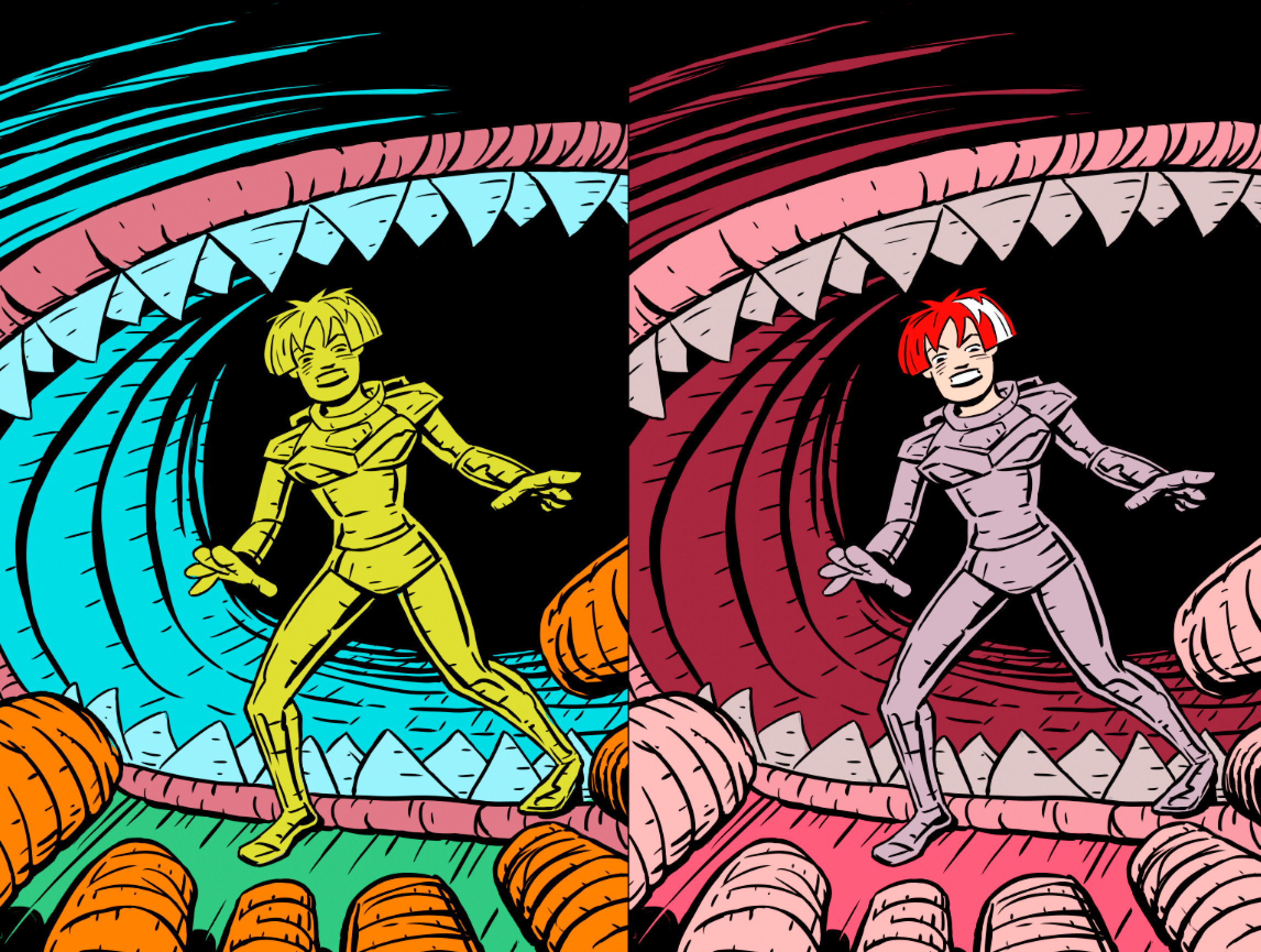
Continuing in Clip Studio, I created the color flats—shown on the left—using random placeholder colors. This technique makes it easy to isolate and edit different elements like the foreground, background, and figures. With everything cleanly separated, I can then apply and adjust the final colors, as shown on the right.
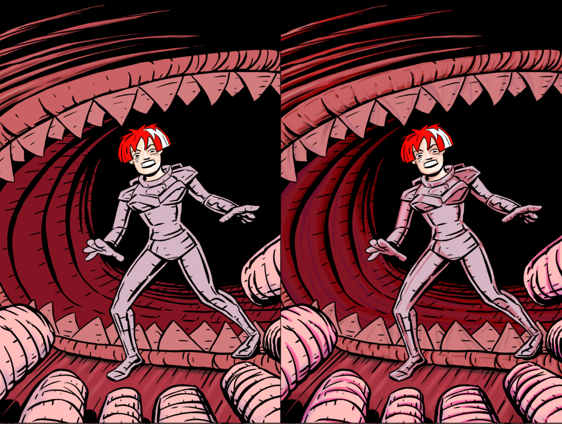
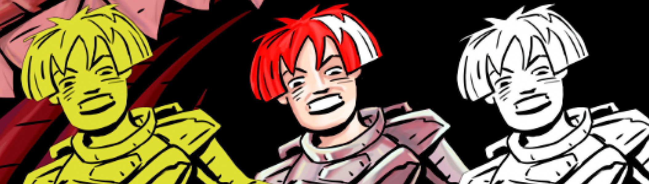
Once I settled on the overall color tones, I started adding more detail. On the left, you can see the base colors; on the right, I’ve added shading on a separate layer.
I also introduced a light source on another layer to highlight Margo and the worms in the foreground, giving the scene more depth and focus.
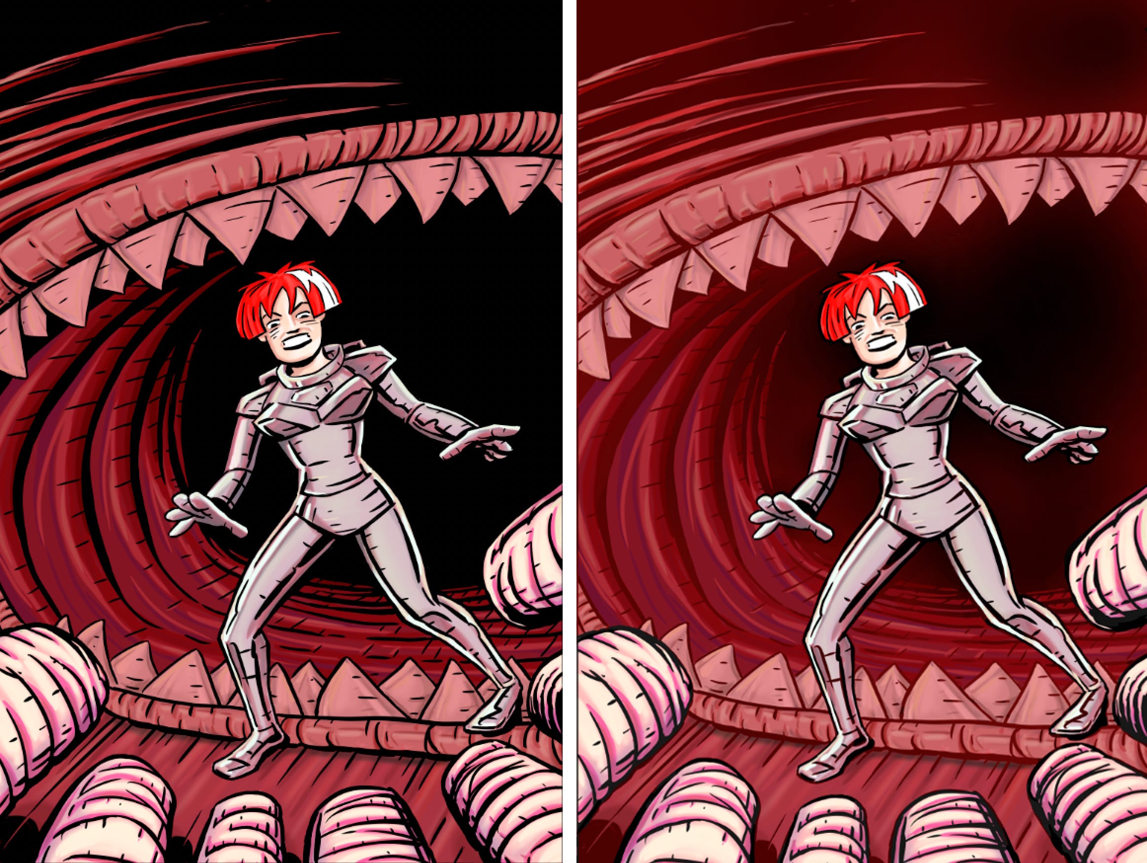
To draw more attention to Margo and the worms in the foreground, I added a transparent red overlay to the black lines in the background to the image on the right. I’m still not sure how I feel about the effect—let me know which version you prefer. I’m definitely on the fence about it.
Next, I’ll cover how I add the trade dress—logos, titles, and other design elements—to give the artwork its final touches and see if it aligns with my vision for the series.
Keep Creating,

The final version with all black lines seems to be the favorite. Sometimes when working in a bubble, it is good to have some imput. Thanks for taking the time to respond. -J
Prefer the version on the left.