
Creating Shadow and Mood
With black and white

Before the holidays interrupted everything, I wrote about the importance of Line Thickness. This time, I want to dig into how blacks are used to create shadow and establish mood.
Before I go any further, a confession: I love a thick black line. Nothing taps into the deeper recesses of the creative id quite like laying down bold black ink. It’s often unplanned, instinctive, and sometimes reckless—an unconscious move that can push an image into uncharted territory. A mistake? Maybe. But mistakes are often the fuel for growth.
Using the same drawing and applying different black shapes and shadow placements can dramatically change the mood of an image. By simply altering how and where the blacks fall, you can shift the emotional weight, depth, and atmosphere of a scene—without changing the drawing itself.
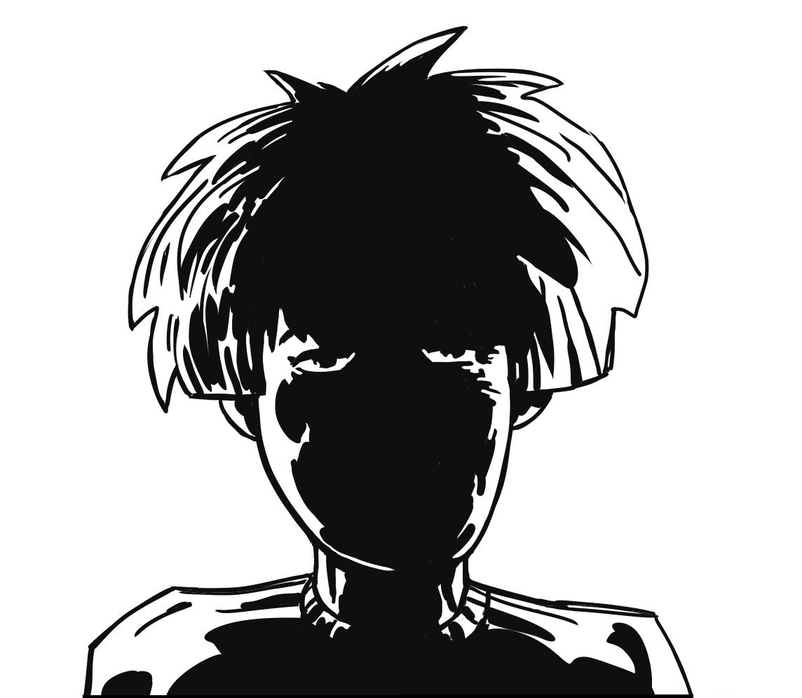
Line Drawing

I’ve created a basic headshot of Margo using just a few lines and no shadows. I often start this way to leave room for color. In this case, we will keep things simple.
Side Lighting

On a separate layer, I laid in the blacks with a thick brush. With the light coming from the left, the shadows fall hard on the right, shifting the mood and adding drama, mystery, and suspense.
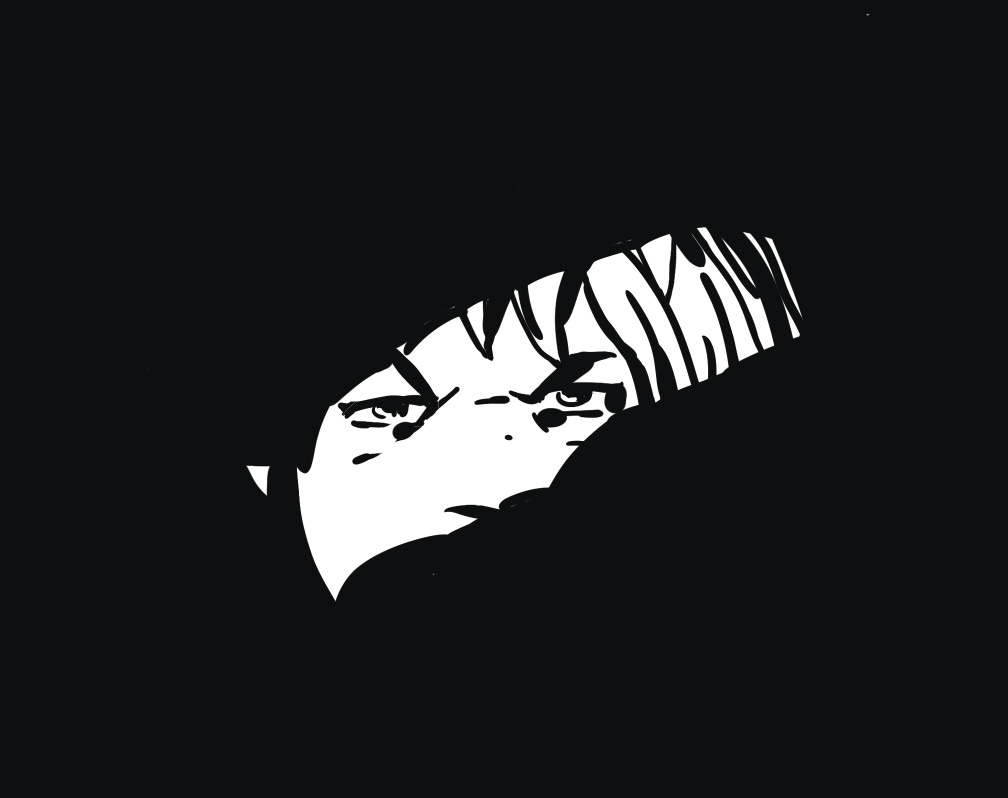
Back Lit
Here, I’ve placed the blacks to create a back-lit effect, with Margo looking into the shadows. The mood shifts again, this time toward something more apprehensive and uncertain.
Out of the Shadows
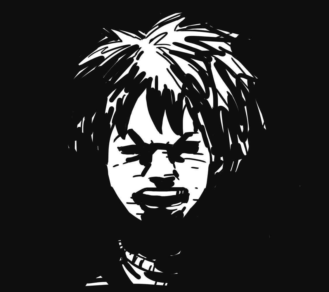
The same drawing, but with the blacks used in a different way. Here, Margo appears to be emerging from the shadows. With just a few well-placed brush strokes, the mood shifts—now it feels angry, defiant, and confrontational.
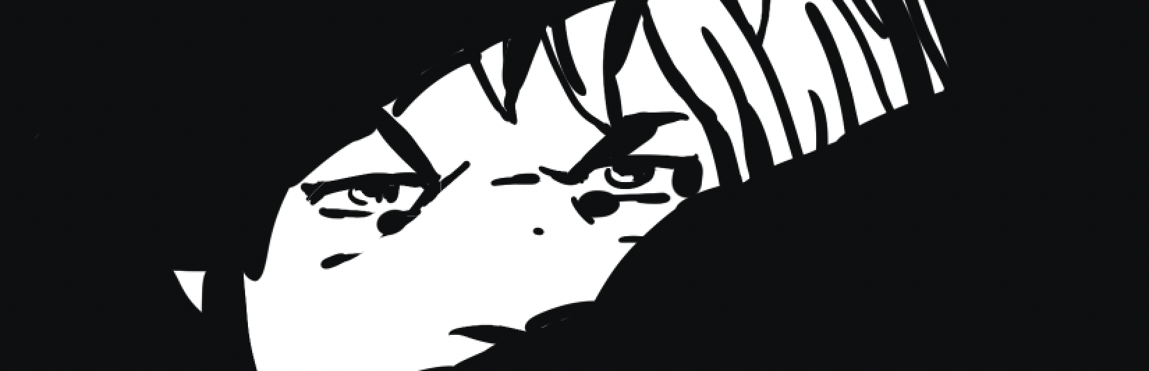
Noir
To suggest a single, narrow light source, the blacks here swallow almost everything. Sometimes you have to sacrifice the part of a drawing you love the most to achieve the right effect.
Silhouette

Silhouette is the final reduction—shape, weight, and intent distilled down to their essentials. When the form reads clearly in black alone, everything else becomes optional. Color, texture, and detail can enhance the image, but the foundation is already doing the heavy lifting.
In comics, clarity is storytelling. The reader should understand the emotion and presence of a character before they ever notice the details. That clarity often comes from embracing simplicity and trusting the power of black.
Whether you’re working traditionally or digitally, the principles remain the same. Tools change. Fundamentals don’t.
Next time, I’ll look at the art of ‘feathering.’
Until then—keep creating, and let the blacks speak.

Fucking DARK! I love it